


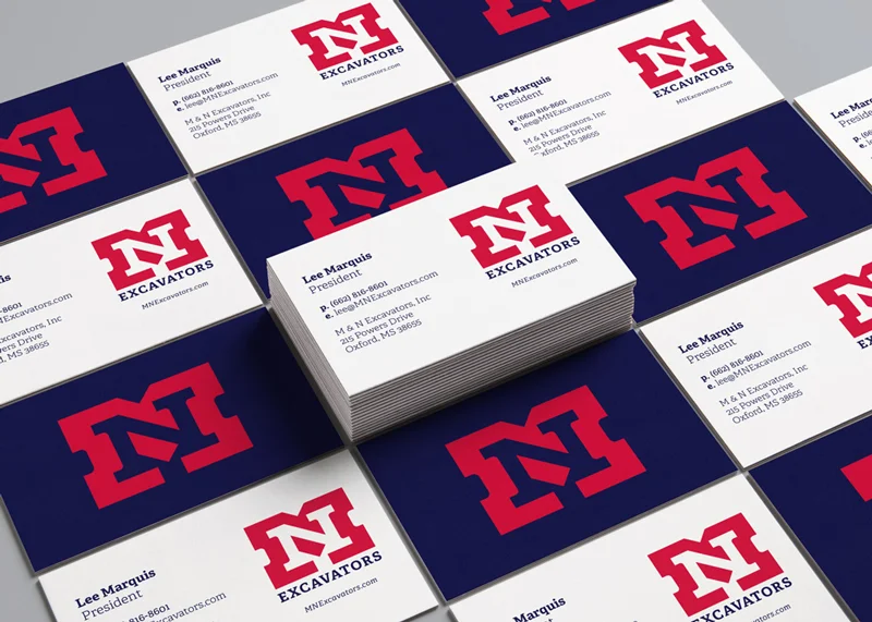
Of all of the identities I’ve worked on, this was one of the most rewarding I can remember. And it proves what you can accomplish with a limited time and a tight budget.
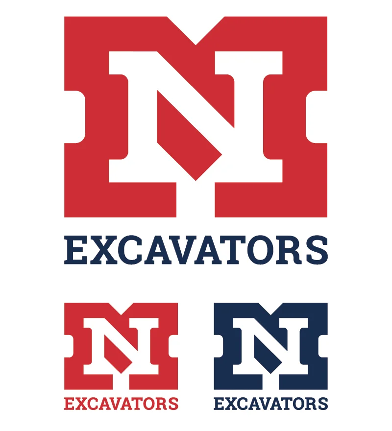
After some initial rounds of acceptable but unexciting marks, I moved away from the boundaries of the project brief and explored some purely typographical solutions. I have always loved the way letters can create amazing negative shapes, so I changed directions and started sketching again. The client was excited about where we ended up and I must say, so was I.
And for being such good sports I threw in a simple brand standards overview and color breakdown for the client.